Tuesday, December 05, 2006

Post-Its... Post-its... Post-its...


A quickie... I've got something AWESOME cooking up. Check back soon. Lols.

Monday, November 20, 2006

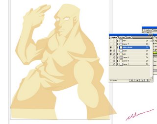
Mega Ted in Flash


Just practicing in Flash again... I wanted to see how I would fare in coloring and inking. I thought this came out pretty cool. I liked how I could easily separate the colors by creating a line on top of it. And I could easliy remove that line at will.


xoxo

Sunday, November 05, 2006

Post-It sketches...


Practicing cartoony -stylized- caricatures... Varying in facial structures. I don't like it if its TOO cartoony, or if its TOO realistic. I like it in-between. It's sweet.


xoxo

Thursday, November 02, 2006

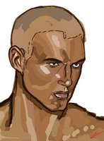
Face Sketch on Flash

This portrait is drawn out in FLASH... made a week or two ago.

Saturday, October 28, 2006

Yeys, yeys, and more YEYS!!!


I know this is sad... but, 1,000+ page views!!! Done in FLASH. Not really my style (not me)... but its practice.

xoxo

Thursday, October 19, 2006

PR3 ULRIKE EXTRAVAGANZA !!!

Last night was the big Season Finale of Project Runway 3...


Uli Herzner is awesome. I was really hoping for her to win. I wasn't a big fan of hers in the beginning, but she grew on me. She's a great designer with an amazing eye for prints and colors. Very inspiring. She was consistent throught the show and most importantly, she got herself into the Final Four solely based on her talent. Some of the finalists, I felt, only made it as far as they did, cuz they supplied the show with soundbites and manufactured drama. She got robbed.


Jeffrey Sebelia won. I was actually rooting for him in the beginning when the cast was revealed. I like his Cosa Nostra work. I love deconstructed clothes (i.e. Jay McCarroll), but his work always looked poorly constructed. He was such a jerk; whining and bitching all the time, causing unnecessary drama... blegh. He was only nice when it's convenient. And the construction quality of his final collection was suspiciously inconsistent. But whatever, he got tons of airtime because of stupid shit, got the "Asshole"-spot in the finals, and won.


Laura Bennett was a one-note-- an AMAZING, Masterful, one-note. But a one-note nonetheless. She catered exclusively to her particular type of customer. She was a character, pregnant, drama maker, soundbite machine, and had a great story to tell. In reality tv land, that's gold... she had to be in the finals. To me, there were other versatile designers.


Michael Knight's great. Like Uli, he got himself in the finals based on TALENT. He was the fan favorite, but his collection was a dissappointment. Compared to other Hip Hop designers-- his work paled in comparison. Regardless, he's still awesome.


Back to Uli... I LOVED her 12-look SS07 collection. I decided to illustrate 5 of her print dresses from her final collection. I love how they flowed down the runway and the how the printed fabrics rippled. She chose the hottest models, too. The last piece was actually a bathing suit... but I drew with the dress still on. I wish Uli the best of luck in the future!!! Can't wait for Season 4!!!


I drew all of the artworks on paper, scanned them in, and painted them in photoshop. The prints were tricky to do. I ended up doing them in layers upon layers... overlaying them on top of each other. I hope you like them... they're my tribute to Uli.


EDIT: Thanks for the love, Blogging Project Runway !!!

Please feel free to browse my artworks and my previous posts.


xoxo
Saturday, October 14, 2006

YeaHyrrrssss!!! +Rant.

After the wacom debacle, I finally figured something out...

***this is a work in progress***


xoxo

Monday, October 09, 2006

F*CK! F*CK! F*CK!

My Wacom Tablet suddenly stopped working... it was working just a few minutes ago... and I have so much stuff I want to paint and learn on it... The damn light won't go on whenever I try to plug it in even with the installation CD.

Click comments for additional rant.


xoxo

Thursday, October 05, 2006

CG Model Painting

So, I tried another portrait painting. This one came off more finished looking than the first one.


I've always been afraid on trying portrait painting. I can't paint, but its great to see that I can do it. A little more practice then I'll get used to it. On this piece I tried doing it differently than the first one. I sketched out the guidelines of the face, referencing from a runway picture I stumbled on a google search. Then, I put in the basic colors on a different layer.


This time around, the "multiply" on the pen is off. This meant the colors wont be belnding on top of each other as it did on the Omahyra painting. I used solid colors of more varying shades, overlaying them on top of each other. Then, I added the shades of the background.


I, then, smoothen everything out, or mostly everything, to come up with the first picture above. It's almost done. I just need to perfect the tones and make the facial features more distinguished. What do you think? Does this style of painting look better than the Omahyra one?

Wednesday, October 04, 2006

Pinoy Tribal Test

I did this during a slow day at my internship...


It started out as a body test and then I ended up covering him with all these markings. They are based off Philippine Tribal tattoo. I thought it looked pretty cool. What do you think?


xoxo

Tuesday, October 03, 2006

CG Painting Omahyra...

This is my very first time painting in Photoshop... It was weird. Not used to it. This one is a little "rough" on the edges. It needs to be perfected. Looks cool though, I think.


I referenced a picture of supermodel, Omahyra Mota. She played Arclight in X-Men: The Last Stand.

EDIT: I added a "brushed-out" version.


xoxo

Thursday, September 21, 2006

George and Wifey...

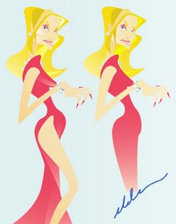
Created in Illustrator and painted in Photoshop. This was originally posted at FRESH COLLABORATIONS.

Shhh... she used to be a hooker.

EDIT: This is what they looked like (in Illustrator) before I painted them in Photoshop.


xoxo

Tuesday, September 19, 2006

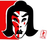
Kabuki Preview...


Here's a little preview of one of the crazy artworks I'm currently doing... Although this Kabuki head kinda looks good on its own. New avatar? hmm...

xoxo


The Fashion Dude...

I made this drawing as a general model for any future designs I come up with.


It's nothing final, but it helps to see the relation of colors with each other. As well as the proportion of the clothes, etc... some of it is pretty ridiculous. LOL. Its inspired by something I did last summer.


xoxo

Sunday, September 17, 2006

Something Ambitious...

This is what i'm working on right now. A little ambitious project in Illustrator... working with vector silouhettes.

Saturday, September 16, 2006

My Green Squishy


I recently became obsessed with the whole "digital dry brush" technique. I tried it again with an old painting. What do you think?

MS DIET UPDATE: I caved... Almost two months of not logging in... 7-17-06 to 9-16-06...


xoxo

Wednesday, September 13, 2006

Girls in Dress... Painted-ish

This part was totally unplanned...


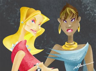
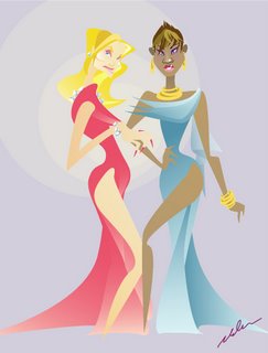
After finishing what came out to be the previous post (2 girls in dress), I exported the file into Photoshop. Then, I selected one color of the image at a time and painted it using one of the brushes. I also used the burn + dodge tool to enhance the colors. And it came out like what you see there. It's pretty cool, I think. I always wondered how to create that flat-textured-painted look, and I ended up actually achieving it here. Well, kinda.

EDIT: Here's the close-up view of the ladies.


Hope you like it. I had fun making this.


xoxo.

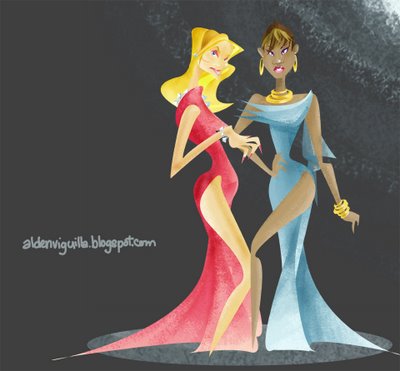
Girls in Dress... "Flash"-type


This is the continuation of what I was doing from the previous post. I tried making another character from the same technique as the other. Pen Tool in Adobe Illustrator... and this is what I came up with. The colors on the blond girl is still a bit pale.

What do you think?

xoxo

Saturday, September 09, 2006

The Flash Lady...


Well, not really... This was ALL done in Illustrator. Not free hand but with the pen tool... which took longer cuz I wasn`t used to it. But the angles were crisp and sharp. It's not done yet... but i think its lookin' good. Colors need to be fixed, though.

xoxo

Wednesday, September 06, 2006

Filipiniana, Modernized...

I've been sketching different looks inspired by Filipiniana (an aspect of traditional Philippine fashion). But I never completed anything. Just sketches. Today, I tried finalizing one.


I did these pieces straight on the wacom... which was a bit hard and weird in a way. I only just color with the tablet... drawing on it . I'm used to the pencil-paper contact. It didn't come out as good as I hope. The first is a straight-out illustration. The other is the color guide and the front-and-back key. Can you tell I like Project Runway? Lol.

What do you think?


xoxo